EIP: The progress, development & experimentation
- Crystal Lim

- Dec 7, 2020
- 4 min read
Before I started to design and experiment on the herbal tea store that I have in my list.
Create a brand
I created a brand image for this project. A brand can help the project stand out by using a story visual to tell a story and easily catch the reader's attention.

The brand is called “Herbal Tea Satu”.
The meaning behind the “Herbal Tea Satu” aspires to represent the hope of Malaysian to strive for unity in diversity. Despite the beautiful differences we have as a community, we have Tea as an essential part of our lives as Malaysians that become one of many things we have in common. On the other hand, the installation can be visualized into a real herbal tea making shop for the audience to experience the shop itself as well as to help make the brand stand out by using a strong visual to tell a story and easily catch the audience's attention.
I have also screenshot the whole progress of designing the logo. The process completely took 3 days to do the amendment.
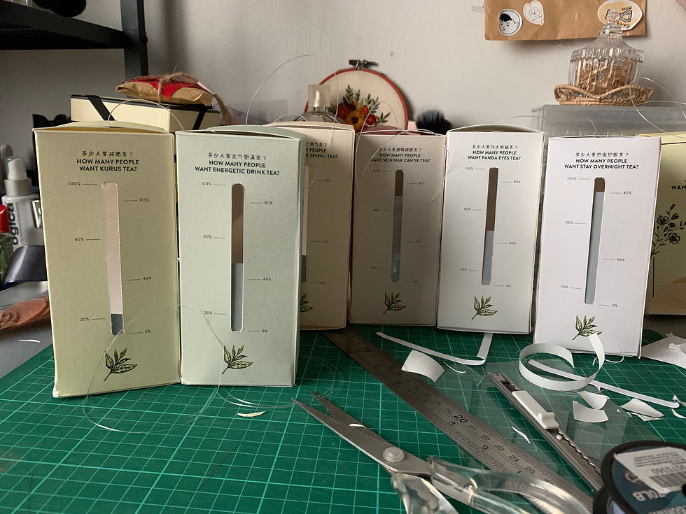
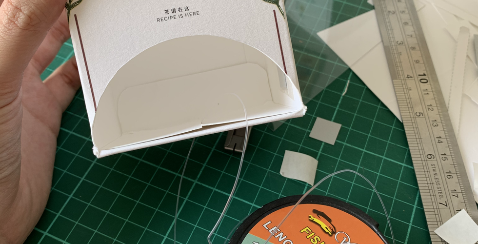
Box holder & tea recipe card design
The concept of this is to create 6 different collections of tea packaging box holders and exploring using a different type of paper to do the printing.

*One of the box holder design*
The packaging box holder is designed to put the tea recipes inside, so that the audience can take the recommended tea recipe from the box according to the health questionnaire results and at the side of the packaging have a data collection on how many audiences are taking the tea recipes.

All the packaging used maple bright paper material to print on and cut it out to fold like a box holder.
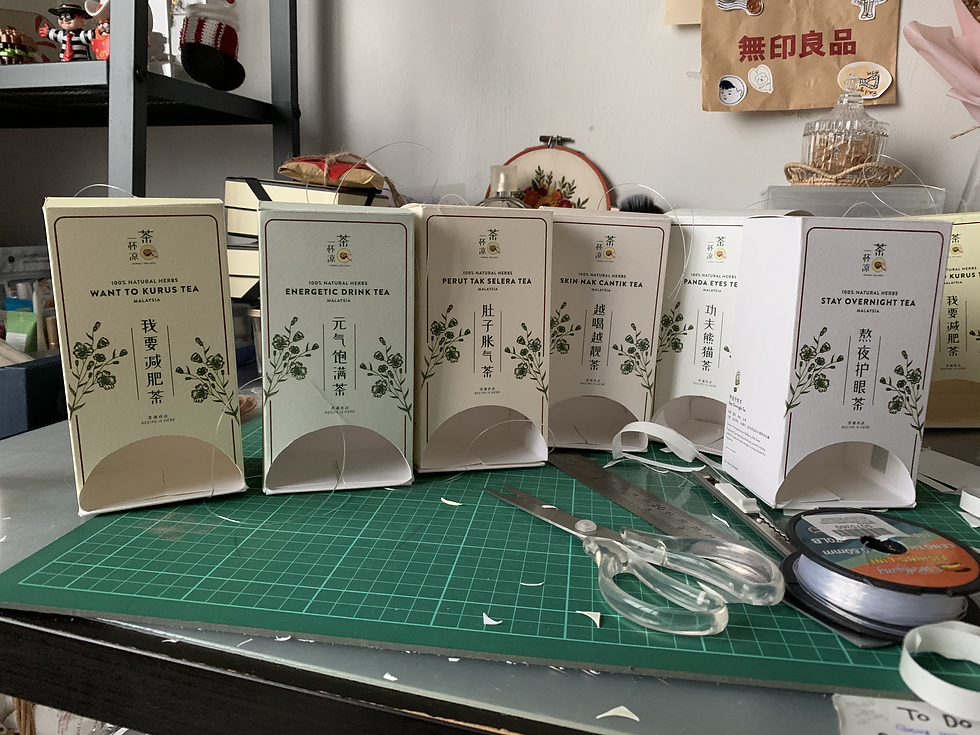


"each design represent different type of tea."
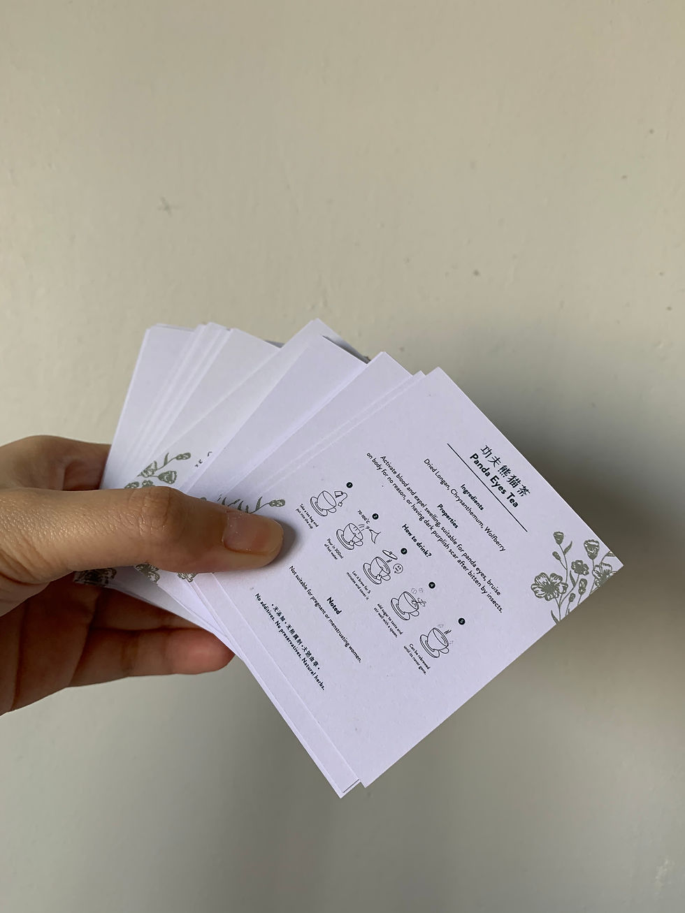
All the cards used Ivory paper material to print on.
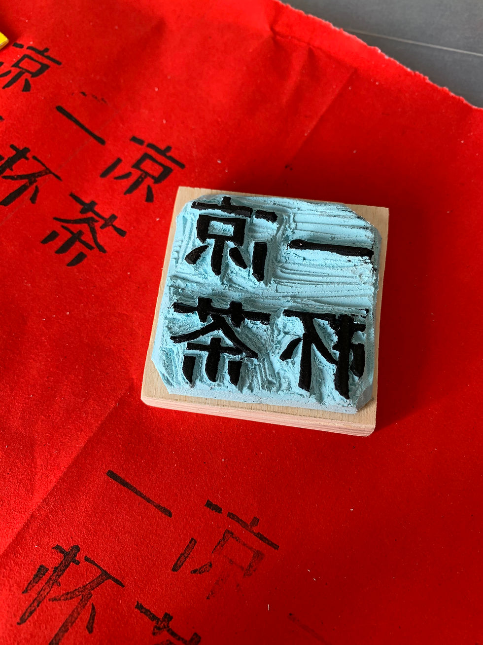
Working Method 1: Rubber Stamp Carving
The stamp is made of hand craved and the method of making these stamps is used hard durable rubber because it is easy to crave.

Using hard durable rubber for the stamp seemed to be the best idea to stamp my brand name on the red paper. To be easy to transfer the design/text, I used alcohol to do the transfer and make sure the artwork is safely transferred to the rubber. That would be an easy way for me to crave.
The outcome
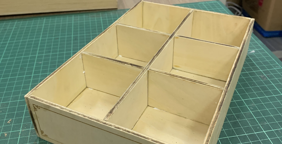
Working Method: Laser Cut (Ingredients box & display frame)
The idea of making wooden ingredients box also created with the laser cut technique which can put six different types of Chinese herbs, so that it will be easier to let the audience take the herb they needed to make the tea bags. The box design idea comes from an old TCM store, the staff normally store the herbs in the box to avoid dampness. The ingredients box inside is added with brown paper for decorative purposes with the herbs. All of the wooden pieces are made up of Basswood as it is a light-weight, but yet sturdy material to work with. The whole dimension of the box would result in 25 cm x 5.3 cm x 17 cm.


And the rectangle display frame which is hanging with six different collections of tea packaging box holders. The rectangle frame is created with the laser cut technique for its precision. Each side of the frame of MDF boards and assembled with wood glue. The rectangle part of the frame measures 67.8 cm in width and 27.3 cm in height. Hence, the whole dimension of the frame would result in 67.8 cm x 27.3 cm x 7.8 cm.
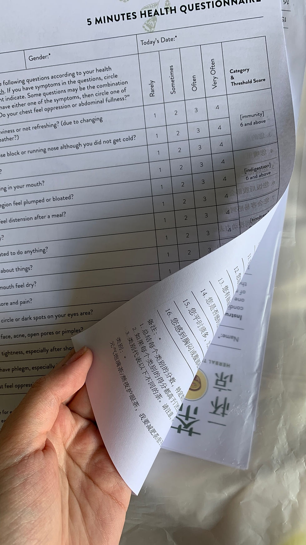
Health Questionnaire (Design)
There are two versions of health questionnaires, which are English and Mandarin, for the audience to choose from. The questionnaire is designed to be A4 size and uses Simili paper material sides.
See the full online version, click here: PDF

Here are the design progress to my envision information piece prior to my final outcome.
A video was recorded my work of the progress and the technologies that I explored in this piece.
After the feedback and comment from the last tutorial, I have amended the commented parts and finished up my envisioned information piece.
Behind the scenes!

Wait... nothing is perfect haha! Of course I have been faced some problems too like using the wrong material to do the stamp and making the wrong template for the box holder. But I’m not afraid of the failure because I think it is a good experience for me to explore more. In this piece, I learned to slow down the steps and think about the every details before making an adjustment. Slow progress does not equal failure. It is a progress, although it’s slow but you are moving toward your goals and desires. So it’s best not to rush the progress, enjoy the moment when you exploring the new things.
Reflection
Overall, the progress of the project is going well and is going the way I have planned, I am excited to see how the final outcome would look like. Stay tuned for the next blog post.


Comments